Brand guide
How nac presents itself — wordmark, color, typography, motion, and voice. For internal use and for partners producing material on the firm’s behalf.
01 — Wordmark
Lowercase, always.
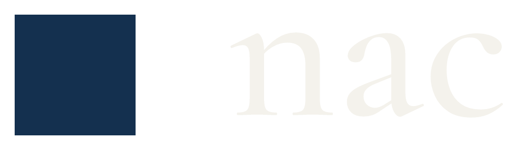
The brand is “nac” — set in Cormorant Garamond, lowercase, paired with the navy square at the cap height. “notacompany.com” is the domain, never the name. The legal line is “nac — a trademark of Gravity Holdings.”
02 — Color
Ink, cream, and a cold light.
Ink
#060607 · Background
Panel
#090909 · Cards & panels
Cream
#ECEAE4 · Type & actions
Navy
#14304F · Mark only
Tide
#3F86AD · Mesh
Sand
#EFE2C0 · Mesh
Depth
#0E2740 · Mesh
Ice
#7FB6CD · Mesh & pulse
The mesh colors exist only inside the gradient panels. Interface chrome is ink and cream alone — no accent colors in text, buttons, or borders.
03 — Typography
Three voices, three faces.
Cormorant Garamond
Display · headlines, names
We craft unique human experiences.
IBM Plex Sans
Text · body, interface
Body copy is set at 16px over a 1.65 line height, in cream at 62% opacity. Sentences are short. Claims are specific.
IBM Plex Mono
Detail · labels, data
Section labels · uppercase · 0.16em tracking
04 — Motion
The heartbeat.
The signature motion is a resting human pulse: a lub-dub every two and a half seconds, applied to the mesh panels and the live indicator dot. Nothing else on the site moves without user intent.
cycle: 2.5s · beat 1 at 6.8% · beat 2 at 20% · rest to 100%
05 — Voice
Measured, specific, human.
- Write as the firm — “we”, never “I”. Tiago’s Feed is the one signed exception.
- Numbers over adjectives. “Sixteen companies, five exits” — not “extensive experience”.
- No exclamation marks, no jargon, no hype. If a sentence could appear in a pitch deck, rewrite it.
- “Human first” is a principle, not a slogan — use it sparingly, and always as a full sentence.
06 — Assets
The square, and a field of it.
The icon is the mark with nothing around it — navy edge to edge, no ground to crop. Covers are the same navy as a flat field and carry no lockup: the profile picture already sits on top of them on every platform that shows a cover.

Icon · #14304F

Lockup

Cover · all sizes below













07 — Copy
How to describe us.
Approved descriptions for media, directories, and partner material, at the lengths those placements actually ask for. The numbers come from the live portfolio, so copy taken from this page is current on the day it is taken.
One line
54 characters
A technology advisory and investment firm. Human first.
Short bio
Under 160 characters — X, directories, conference programmes
A technology advisory and investment firm. Since 2013: 21 companies built, backed, or advised. Human first.
LinkedIn tagline
Under 120 characters
Technology advisory and investment. Operators, investors, and builders of our own products. Human first.
LinkedIn about
Medium — profile and company About sections
nac is a technology advisory and investment firm. Since 2013 we have worked alongside founders and institutions across 21 companies, 7 of which have exited. We work in three practices. Advisory sits on the buyer's side of the table: technical due diligence on software companies for private equity and corporate acquirers, the engineering team and its leaders included. Engagements are few, long, and led by one partner. Investment takes pre-seed and seed positions alongside the founders we back. Creations are products we design, build, and operate ourselves — the practice that keeps our advice honest and our judgment current. Human first.
Press boilerplate
Long — the paragraph that closes a release
nac is a technology advisory and investment firm founded in 2013. The firm works across 21 companies as operators, investors, and builders of its own products, with 7 exits to date. nac is a trademark of Gravity Holdings. More at notacompany.com.
Naming
How the firm is referred to in copy
The firm is “nac”, lowercase, in every position including the start of a sentence. “notacompany.com” is the domain, never the name. “not a company” is acceptable only where a legal or long-form name is required. The legal line is “nac — a trademark of Gravity Holdings.”